Renovation update - a blank canvas
 It sure has been a long time coming, but here is my first post about renovating our home a couple of months ago. Thank you to everyone who has shown enough interest to ask, and thank you for your patience! (Here was my original post announcing this renovation. Oh, the optimism!)
A blank canvas
It sure has been a long time coming, but here is my first post about renovating our home a couple of months ago. Thank you to everyone who has shown enough interest to ask, and thank you for your patience! (Here was my original post announcing this renovation. Oh, the optimism!)
A blank canvas
This is not really a "before and after" story, since there's till a long way to go: we're more at the "before and three-quarters" stage. That is to say, our home is a blank canvas. The bones are complete, and we are all moved in, but a lot of the character is still to come. There are very few paintings on the wall, or cushions on the couches, or plants under sunny windows. You never know. Perhaps I'll write a proper "after" story of this house to include all those things, one day.
Ours wasn't a big renovation per se. We weren't adding or removing any rooms, it was more of a cosmetic update. New bathrooms and kitchens, fresh paint on the walls. Pulling up the old carpet to expose the original floorboards. That kind of thing. Simple and affordable, yes?
But of course we managed to trip over every cliche you've ever heard of to come with renovating a house that is more than a century old. The work took twice as long as we had anticipated, and almost twice as much as we had budgeted. There were problems with builders and tradesmen and even now, more than eight months after we started, we are still waiting on some little jobs while other small problems require fixes.
So you can blame the cliches for the blank canvas state of our home right now. Essentially our entire decorating and pulling-together budget (and a hefty sum over and above that) was spent, instead, on scope-creep that we probably should have anticipated. You can read the story of all that happening (and see some scary photos of the work in progress) here. Actual walls made out of straw, anyone?
And now for today's reveal: the lounge / dining room
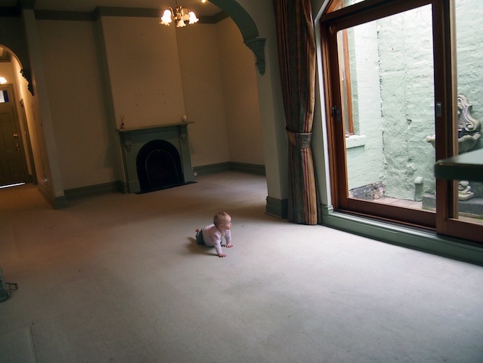
This is what it looked like before we started. Can you believe Madeleine wasn't even walking at that point? What a little no-haired cutie!

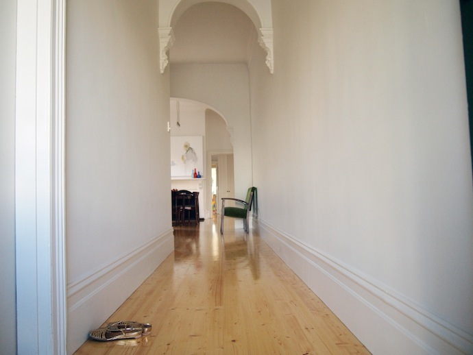
 Now, here is what we did to those two rooms and the hall:
* Removed the hideous decals from the walls and windows * Painted the walls, doors and ceilings * Replaced the light fittings * Replaced the locks, door handles, light switches and power points * Removed the carpet * Failed to rescue the original floorboards, replaced them with new boards * Discovered the floor joists underneath were rotten, so replaced them too * Replaced the window dressings * Re-tiled both fireplaces * Removed the mouldy cement water-features from the light well * Painted the light well * Installed a decking in the light well at floor level with the inside floor
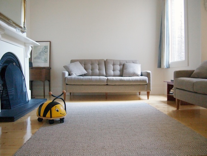
And this is what it looked like last Friday (somewhat uncharacteristically tidy because Madeleine was at daycare).


 Lesson 1: Creating light
Look how gloomy and dismal these rooms were in the "before" photographs. Yet I had every (working) light in the house on when I took them. When we were choosing new lights for these rooms, we kept telling each other "The house is really dark, so we will need a lot of lights with decent wattage."
Turns out, a lick of white paint (or three or four - it took extra coats to cover that horrible green on the walls AND ceiling) and some fresh, light floorboards can completely brighten up a space. I took these "after" photographs with just the aid of natural light and I can't believe how much brighter the room looks (we used "Antique White USA" paint throughout, if you're interested).
Lesson 2: The illusion of space
We learned the same lesson when it came to space. This is not a big house, and when we started the renovation, we would tell our friends, "The rooms are very small, it's just a cottage." But we were amazed at just how much space there seemed to be in the same rooms, once the walls had been painted and the floorboards put in place.
For this reason, we have both curtailed our natural desire for big, bold, splashes of colour. There are not feature walls anywhere in our house, of either paint or wallpaper. The curtains are fairly neutral and unobtrusive. We kept everything simple and fresh to give the existing light and space room to play.
Lesson 3: Introducing personality
The plan, of course, was to bring the colour and character in with the accessories. Artwork on the walls. Cushions and throws and a feature arm-chair or two. Plants in pots and stands and hanging from ceilings. A really great rug. All that will have to come later, when the budget recovers from Phase 1.
Being forced to wait for all those things does have its advantages. Most importantly, living in the house before properly decorating it gives us time to see how things work for our family, specifically. I think we'll be making different decorating decisions now than we would have before we moved in.
Lesson 4: Toddler proofing
I'm a firm believer that you can still have a nice-looking home while keeping it safe for the little ones. We don't have any sharp or breakable items down low. In fact at the moment all we have are books, but I do want to add some other items, like globes and wooden ornaments, that look good but are still kid-safe. There's rubber around the hearth tiles to protect the children from sharp edges, safety glass in the windows, and child-proof plugs in all the power points. A consultant from Kidsafe came through the whole house to help us ensure it was safe.
We have a "no eating on the couch" rule, and no craft or messy games are allowed in here. It works without being too oppressive, because we have a play room for all that (more in a later post).
What's next?
ARTWORK: Clearly we need some art on those blank walls. But how many pieces? How big? We still haven't decided. We have some lovely canvases and prints resting on the floor in Emily's room right now, some of them quite large (like this one, which is 1.5 x 1.5 metres) but neither of us can decide where to put them or whether they will suit the space.
Apparently there are some rules to hanging artwork that help pull a room together subtly. Can anyone tell me about these? I've heard the paintings are supposed to be hung at eye level. But what part of the painting should be at eye level? And whose eyes are the measure of the level? (I'm short). Isn't there a rule about maintaining the same height in the middle of each work? Do you do that no matter what the size of the painting? What if (as in our case) there are paintings or mirrors above the fire-places, which force them to be quite high (certainly above my eye level): do we maintain that same height around the rooms, or go lower? It's all very confusing.
FURNITURE: We'd love to find a low, mid-century sideboard / radiogram (like this) to sit along the hallway in the lounge room, to open up that space a bit more. Even better if it was made of rosewood to match the dining table. We are keeping our eyes peeled locally (and saving our pennies).
We also want some other side tables, large pot plants, table lamps (I love these!), those sorts of things. But the ideas we had before living in the room don't seem quite right now that we're here. Decisions, decisions.
THE FLOOR: I think our floor rug needs to be twice the size of the one we have here, to give the room a greater sense of luxury and space. We both really love the colours and designs in this one.
SEATING: Those couches were new and while we like the look of them and are happy with the neutral tones (the plan being to brighten things up with cushions et al), they have actually turned out to be quite impractical. They are too tall, for one thing, so short little me struggles to breastfeed on them because my feet don't touch the floor properly! Also, those little buttons that give the cushions dimension easily come loose (one has already fallen off) and dig into you if you like to curl your feet under you as I do. Finally, they are so heavy that even with padding under the legs, they have already damaged our brand new and rather expensive floor. Never mind. First world problems, Naomi!
DINING: The dining table and chairs were a splurge. They are mid-century Brazilian Rosewood pieces, although we saved a bit by taking the chairs in original condition - one of these (much later) days we will have them renovated and reupholstered. The table extends out to seat more people, which is perfect for bigger gatherings without over crowding the fairly small room the rest of the time.
Question: what kinds of table coverings suit this kind of furniture? We love the table so we don't want to cover it completely with a table cloth, but we do need place mats and coasters to protect it. I think the cork place mats look kind of tacky - at least the ones I've seen - but the idea of adding to my laundry pile with cloth place mats is less than appealing. Any tips? Also, I really need to buy a beautiful, big fruit bowl (I love the look of these but am not sure about the size - mine needs to be HUGE). At the moment, that fruit is sitting in a Tupperware salad container.
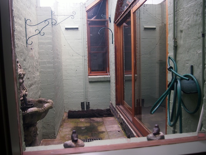
LIGHT WELL: We love that the decking out here makes this space totally accessible. It's no longer damp or gloomy or dirty, so it's a lovely little contained place for the children to have supervised play while we're at the table. But because it is such an integral part of the dining room, we also need to decorate it nicely, to incorporate that space into the rest of the house. Mr B wants some kind of artwork out there (he likes mosaics but I'm not keen). I like the idea of a vertical garden but we're not sure if there will be enough light to maintain it. Mr B makes the good point that if the plants became sick or scrappy, it would look really awful. Another idea is to commission some kind of street-art style painting, or perhaps invest in some vintage outdoor signage. I'd love your ideas!
HALL: There's nothing there right now. I'm still thinking an Eames Hang It All coat rack would be nice, although I'm now leaning towards the neutral rather than multi-coloured version. That, and some kind of shoe-rack, an umbrella-stand, and other practical accoutrements. I'm yet to find the ones I like best.
Well, there you have it folks, our lounge/dining area in its "blank canvas" state. Despite the challenges, we really love this part of our new home. It's especially nice to have a "grown up" lounge area, since the kids have their play room out the back. I'll invite you into some of our other rooms in subsequent posts on this blog.