JOURNAL
documenting
&
discovering joyful things

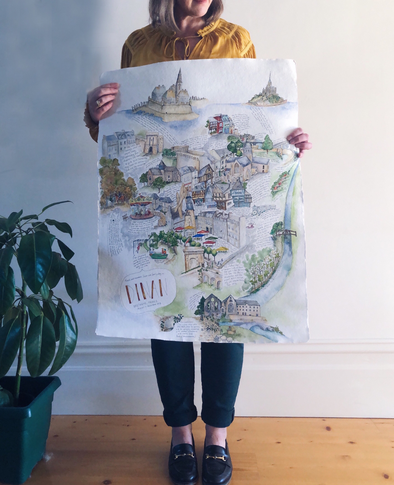
The memory-map
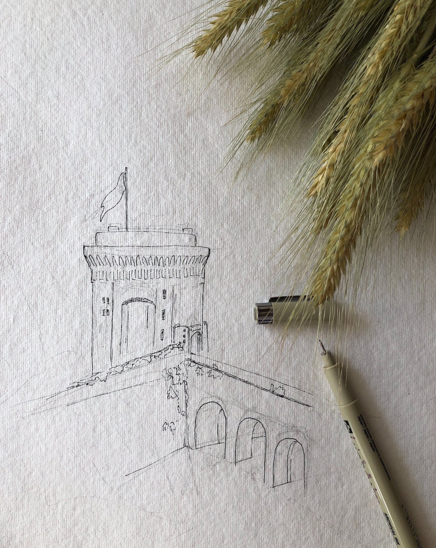
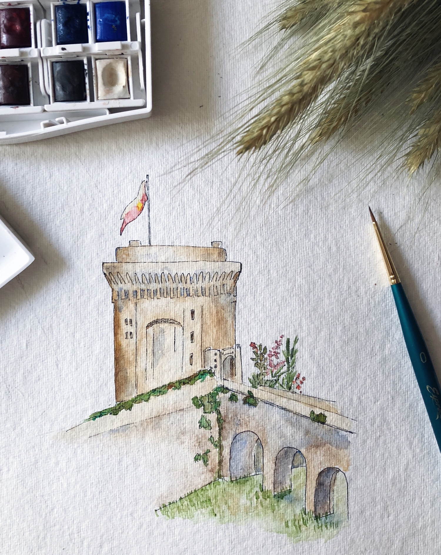
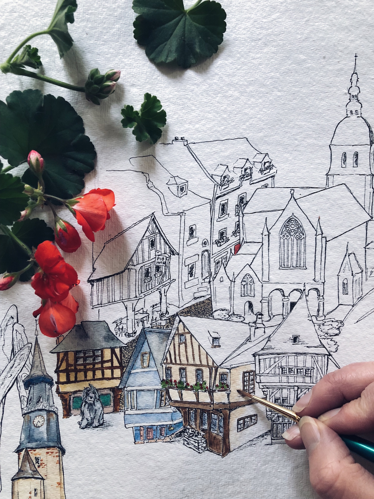
The first thing I painted was the 14th-Century chateau, one night after we had explored it with our friend Tonia. We’d set out early that morning with a backpack stuffed with chopped vegetables, bananas, baguettes and the homemade koulourakia we’d baked the day before from a Meals in the Mail recipe, to walk the ramparts all the way around town.
At the chateau we stopped to catch our breath and polish off our little lunch, sitting on the ancient stone wall amid glorious pink and red flowers, before buying four tickets at the gate and heading inside to explore. The chateau is formally known as “donjon de la duchesse Anne,” or “the keep of Duchess Anne,” a woman beloved as a ruler and protector of Brittany from 1488 until her death, as well as being Queen Consort of France (twice).
Today, her keep is almost empty: no roped-off antiques or baltic pine replicas here, just empty rooms with carved shutters half-closed over diamond-paned windows. It made space for the ghosts, and we could almost feel the past walking among us in those empty rooms. We climbed the narrow spiral-stone staircase up, up, wandering the rooms where once the Duchess Anne ate, conversed and slept, until we emerged to blinding sun and gusting winds on the roof. Then we headed down. Down, down, into the smoke-stained ‘dungeon’ of a kitchen, where there were no windows and Tonia and I had to use our iPhones as torches so that we could all make it down the final flight of stairs without breaking any limbs.
At various levels (especially in the guards’ rooms), medieval toilets were cut into the stone and, from the smell, were still occasionally in use. We only just - with seconds to spare - managed to stop four-year-old Ralph from doing the same, and the laughter from our little party at this lucky escape carried us all the way back to our still-new (to us) apartment.
So later that night, when the children were sleeping the deserved sleep of the utterly exhausted and Tonia and I sat up eating cheese and drinking rosé, I drew the chateau on the blank paper of my future map, and wrote our little story down next to it.
Piece by piece, as we built memories, I added them to the map. Picnics at the nearby ruins. Baguettes from our favourite boulangerie. Trips to Saint Malo, le Mont Saint Michel, and Broceliande. The carousel the children loved to ride, where first Scout announced, “Our town is amazing!” The church with the bells that punctuated our days and nights with such beauty. The big, old English sheepdog we called Sarah, from that time I said “Look, that dog has it’s hair up” and Ralph replied, “How do you know it’s called Sarah?”
Painting at night after each adventure, there wasn’t any strategy or forethought to the map, and this made for lots of mistakes. I painted the Thursday markets one evening after carrying home the week’s bounty, and, a few days later, drew in the clock tower behind it after we had climbed to the top. Then a month or two further along, when I decided I needed to paint in the grand old buildings that lined the market square, the clock tower was already in the way. In my painting it has grown legs and journeyed a full block away from the rue de l’horloge, where it stood since 1498. I drew Sarah the dog before adding in the buildings around her, and it turned out she was not even remotely to scale. I had accidentally turned her into a canine giant, eclipsed only by the baguettes, which are the size of some houses. Saint Malo was on a wonky slope, the abbey at Lehon slid over onto the very bottom of the paper, and a strange, ibex-like creature on the carousel loomed over everything else.
The mistakes have come to be my favourite parts of this map. I could have waited, of course, collecting these moments in my mind to faithfully reproduce them back home. Carefully copying or tracing a roadmap of Dinan, and then plotting out our favourite memories with both accuracy and artistic arrangement.
In fact, that was my original intention in making the map. After taking multiple wrong turns when trying to follow the map of the ramparts given to us by the Dinan tourism office, Tonia and I joked that I’d paint a more accurate one, and give it to them when we left.
But the best adventures are unplanned and precious moments come unbidden. And if you don’t stop to notice them when they happen, those moments can journey on by, altogether unseen.
So I chose mindfulness over method, thankfulness over design, and pasted my little acts of gratitude like patchwork all over the paper, living each drawing in the moment without pausing to plan the final piece.
When we left the village in December, I didn’t know what to do with the map. The handmade paper was so thick and large it couldn’t fit into a tube, so I carried it with me from Dinan to Paris, Paris to London, London to Cumbria, Cumbria to Inverness, Inverness to Edinburgh, and Edinburgh to Melbourne, Australia. After we returned home, it lay rolled up and forgotten on the sofa-bed in our front room for a month, buried under clothes awaiting dry-cleaning, until finally in mid-February I uncovered it and found the time - and emotional fortitude - to finish what I had started on that hot summer’s day at the chateau, back in August.
So here it is, in all its wonky, unplanned, mistake-ridden, navigationally-bereft, emotionally-rich glory. The story-map of our sabbatical in France, and a pen-and-paint act of thanksgiving.


Ten days of illustrations

I’m just past 10 days into the #100DaysinDinan project, and so far I am loving it! As I had hoped, taking out the time to draw these pictures each day is taking me back to our time in the village, and how it has influenced me and my family in big ways and small.
To jog my memory and find things to paint, I’ve been scrolling through photos in my camera, and that has been an extra-welcome trip down memory lane. The children love to see what I’ve been painting each day, often chiming in with “Remember when…?” as they hold the little cards in their hands.
I’m making the envelopes for each card by tracing one of the original envelopes the cards came in, onto used calendars and magazine pages. A stamp or two, and the address: there’s not much room for anything else, so into the post they go.
Here are the first 10 that I’ve painted and posted, with a bit of the back-story behind them.

hotel de beaumanoir
The beautiful, 15th-century archway to the former hotel de Beaumanoir: 1 rue Haute-Voie, Dinan. This was just around the corner from our apartment and after dropping off our bags on Day 1, we took a wander through town. This intricate stone archway took my breath away, and I couldn’t believe I was going to live in such a place
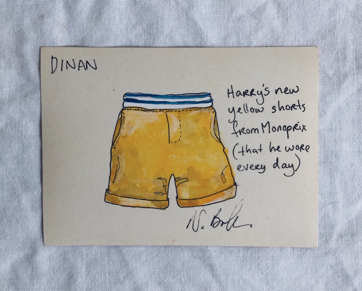
new yellow shorts
We arrived in France from the coldest month of winter in Australia, with very few summer clothes in the suitcase as the children had already grown out of theirs from six months earlier. While riding the carousel in the hot sun the day after our arrival, four-year-old Ralph found his jeans just - too - hot. I popped into the Monoprix and bought him these sweet yellow shorts, which he loved so much that he wore them nearly every day until the end of summer

maison bazille
There are several chocolatiers in Dinan, and we sampled them all! Our favourite was Maison Bazille on 10 Rue de l'Apport. Partly for the silky homemade chocolate (made on the premises) with all kinds of flavoured ganache, and partly for the macarons, but mostly because Anne, the proprietress, was just so lovely. She would welcome us with beaming smiles, and when we returned after three weeks in the UK, she gave the children cuddles and kisses. We would slow down every time we walked past, in order to catch her eye and wave

half-timbered houses
Dinan is famous in France for the half-timbered houses that line its streets. They are crooked and wonky, because when they were built (mostly the 14th and 15th Centuries) there was a tax on floor-space at the ground floor, so people built small at the base and increasingly spread out as they built up. (This particular house is now a restaurant, La Mere Pourcel on 3 Place des Merciers. I really wanted to eat there but it looked too fancy for a mum and two kids, so I’ll have to go next time!)

moules-frites marinieres
Ralph was gung-ho with the moules-frites from the very beginning, but Scout only discovered them during a visit to Mont Saint-Michel. It was a steaming hot day, and we sheltered from the sun in a restaurant for lunch. I’d ordered myself a bowl of moules-frites while the children had pizza, but Scout ended up stealing more than three-quarters of my mussels. We told the proprietress they were the best we’d ever tasted, and she smiled and shrugged, “c’est la saison” (it’s the season)

rampart towers
There are lovely little towers in the castle walls all the way around Dinan. This one is over one of the steep streets that lead between the hilltop part of the town, and the ancient river port. The children and I would walk along the ramparts on the way home from school, and stop to take in the view from the top of this tower

the padlock letterbox
The steep, cobblestoned rue du petit fort leads all the way down to the river at Dinan, and the whole way down the little street is lined with ancient and fascinating homes, shops and cafes. This door is almost at the bottom, and boasts the biggest padlock you have ever seen, which now does duty as a private letterbox

sea-birds
Dinan doesn’t feel like a seaside town. There is a river, to be sure, but it no longer dominates the landscape or trade, ever since the town moved up the hill and behind the castle walls for safety, many hundreds of years ago. But this is the west coast of Brittany, and the sea is still close enough that sea-birds call and circle in the morning, and wander through the streets hoping for scraps from tourists at lunch

boats on the canal
The river Rance, by the time it gets to Dinan, is little more than a canal. The first week we arrived, we took a ride on a river-boat up the canal to the neighbouring town of Lehon, the children fascinated when we had to stop at a lock and wait for the water to rise. There was a path beside the canal where horses used to walk and pull the boats. Once, a family’s horse sadly died, so the captain’s wife had to ‘harness up’ and pull the boat herself. There are photos. In the summer, weekender boats like this one I’ve painted would chug past and we’d wave at them

birkenstock kilometres
The day before we left on our adventure, we took the children to the Birkenstock store in Melbourne and picked up a pair of sandals each. It was winter here in Australia, and they had long grown-out of their sandals from the previous summer. When we arrived in France, those sandals became synonymous with the new sense of adventure and resilience my children developed. From complaining about a two-block walk in Australia, they cheerfully walked 10+ kilometres every day in those sandals

Painting hacks (and it's ok if you're not doing it right)

Recently when I wrote my frequently asked questions post, I deliberately neglected to answer one of the questions I get asked the most often… “Can you teach me how to paint?”
The truth is that I have never felt confident enough to ‘teach’ painting, because in order to teach something it helps if you actually know what you are doing yourself! I am completely self-taught when it comes to my illustrations, and by “self taught” I mean I just keep painting, experimenting and practising… I haven’t read any books or watched any YouTube videos to improve my techniques.
(Although I’m actually hoping to remedy that this year, and take some formal lessons in botanical illustration at the Botanical Gardens in Melbourne, so maybe one day in the future I’ll have something more useful to share on here.)
But in the meantime, rather than teach you how to paint in any strict, best-practise or rules-based way, I am going to share some of the tips, tricks, hacks and techniques that I have stumbled across so far on my illustration journey.

Why it’s ok to not do it right
Because I’ve never received proper training, it is highly possible that the things I share are not the best way to do things, or that I’m simply “not doing it right.” And I think it’s important that we all seek ways to feel comfortable with this, when it comes to our own creative work.
“Not doing it right” is why I’ve held back on sharing too much in terms of how-to-paint content in the past (fear that I’m not doing it right, and fear that I’d therefore be teaching you to ALSO not do it right).
But now I’m thinking differently, and I’m going to call myself out on this defeatist attitude. Really, it’s just another form of “imposter syndrome,” the feeling most of us experience sometimes (or often) - especially when it comes to creativity - that we are not good enough, even when others appreciate our creations - and that any minute, the world will see us for the failures we secretly believe we really are.
Why do our brains do this to us?? This blog is not the place to explore the depths of human psychology (although I do talk a lot about imposter syndrome and the Inner Critic in my Create with Confidence course), but today I will stand up to my own Inner Critic and hopefully bolster you to stand up to your own, by sharing my perfectly-imperfect tips for watercolour painting.
My hope? That you will a) find some tips in here that are useful, but b) even if nothing here is useful, that you will feel empowered to experiment, play and create, without the constraints of “doing it right.” Just go for it!
Ok, shall we get started?

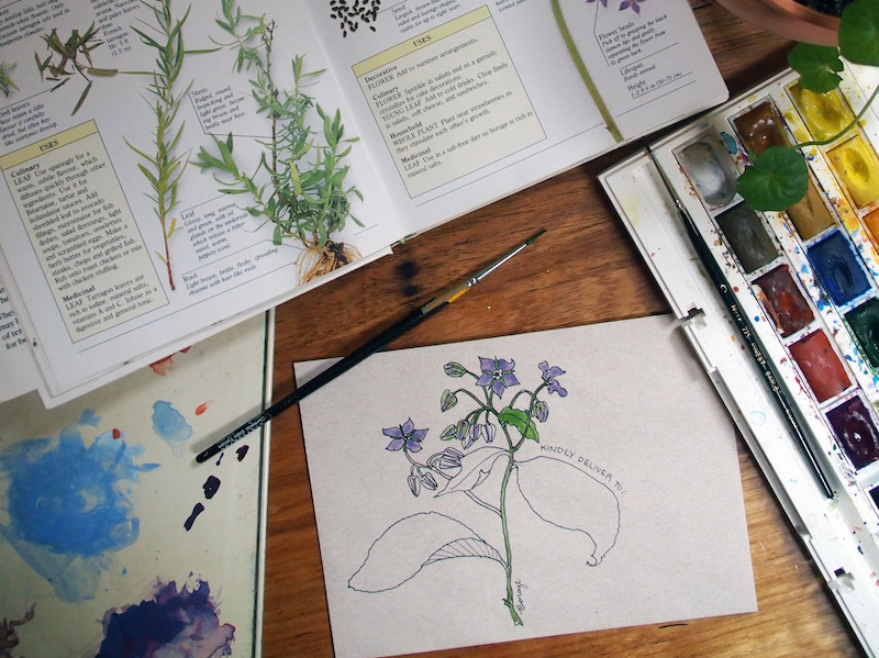
1. It’s ok to pencil first
You know those Instagram and YouTube videos in which people deftly put wet brushes to clean, white paper and in a matter of minutes create beautiful floral wreaths or sleepy cats on cosy couches, or potted succulents in greenhouses full of charm?
Yep, I can’t do that either.
I sketch my picture out using pencil first (2B because anything darker becomes harder to rub out later), then use waterproof black pens (my preferred brand is Sakura Pigma Micron) to draw it exactly the way I want it to look. Depending on what I’m wanting for the finished product, I add in more or less pen detail, and when that’s done, I rub out the pencil marks.
By the time I come to do the painting, it’s really not much more than colouring in.
2. Painting tools (otherwise known as “You can get your paints from the supermarket”)
My father always used to tell me “It’s a poor workman who blames his tools,” and this is as true in the art-room as it is in the workshop, garden or kitchen. To whit: great tools can make life a lot easier, but they are no substitute for elbow-grease and practise.
For many years, I used sets of watercolours and gouache paints picked up in a toy-store and supermarket respectively. From time to time I still dip into my kids’ Crayola paints, and have used them for all kinds of projects, including illustrations I’ve been paid to create. Until two years ago, I was still using the used gouache paint set my grandmother gave me when I was 10 years old.
In case you’re wondering which is which:
Watercolour paints are made by mixing colour-pigment with binder. The paint is applied by wetting it and then brushing it onto paper. Once the water dries, the binder fixes the pigment to the paper. Watercolours are super-versatile because you can make the colour stronger or weaker depending on how much water you use, and you can easily blend them together or layer them over each other in-situ (i.e. on the painting itself) to create almost any colour or shade you want
Gouache paints are very similar to watercolour paints, except that an extra white pigment (like chalk) is added, to make them brighter and more opaque. (Think Toulouse-Lautrec posters and you’ll know what gouache looks like). You can also blend gouache and watercolour with one another to create just the right colour or intensity you want
Even now, my “best” paints are really hobby-grade paints (I have Winsor & Newton watercolours in a set and Reeves gouache in tubes). I’m sure an upgrade would be a good thing, but I haven’t made the plunge so far and, if you’re starting out and don’t have the means or desire to invest just yet, don’t let that stop you: some decent brushes (my favourites are 'Expression' brushes by Daller-Rowney) and a good feel for colour-blending are all you need to create lovely paintings.
Which leads me to…
3. Colour-blending 101
Alright, most of us know that there are only three primary colours (colours you can’t mix from others): red, yellow and blue. With the help of black and white, you can realistically create all the colours, shades and tones you need with just these basics.
Luckily for us, most paint sets come with a lot more options, so when we are ‘blending’, it’s to create subtlety and more realism. This is how I blend my colours:
First, I get a non-porous palette on which to mix my colours. I have an old plastic paint palette that used to belong to my grandmother, but anything non-porous will do. I also use dinner-plates, the plastic lids of my paints, anything I have handy at the time
Onto that palette, I add a small amount of the first colour, either by adding a lot of water (via my brush) to a hard colour in a paint set, or by squeezing a tiny bit of that colour from a tube
Next, I add my second colour to the palette - nearby but not touching the first - in the same way. And so on for any subsequent colours. So for example if I was making purple, I’d do this with blue and red.
Now I’ll bring a tiny bit of one colour into the middle, and a tiny bit of the other colour into the middle, and mix them together. Based on what that looks like, I’ll add little bits more of one or the other colour, until it looks right. At this point if necessary, I might bring in some other tones, for example a bit of yellow to give it warmth, or white to brighten it up, or a tiny bit of black to tone it down.
The trick is to do all of this gradually, one small bit of colour at a time, so that you can rectify any mistakes or any time you’ve overdone it with one colour, and build up slowly until you get exactly the shade you want.
If necessary, I test my blends on a scrap piece of paper, just to see how they look once they dry, and also to test how much water to add, to create the look I’m going for.
Once I’m happy, I use this new colour on my painting. If I find I’m running out, I start the process all over again but make sure to do it before the original blend has run out, so that I can match the shade as closely as possible so that my painting remains consistent.
4. Colour-blending combinations that come in handy
While travelling for five months I had only the smallest of travel-paint sets, so I had to do a lot more blending to get the colours I like, than I do at home. I am drawn to a muted colour palette with soft, natural tones. But my little travel paint-kit was full of bright and primary colours. Here are some of my personal thoughts on colour, and some of my favourite combinations to achieve the tones I love.
First of all, I have something to say about black. I’ve learned from experience that black can easily dominate a watercolour picture. Look around you: most of the things you think on first impressions are black are not actually true black - most likely they are a kind of dark grey, or a warm kind of black or a cool kind of black… do you see what I mean? For this reason, I almost never use actual black in my paintings (other than in the ink outlines). Instead, I either water it down heavily until it becomes a kind of grey, or I use this blend in the top row…
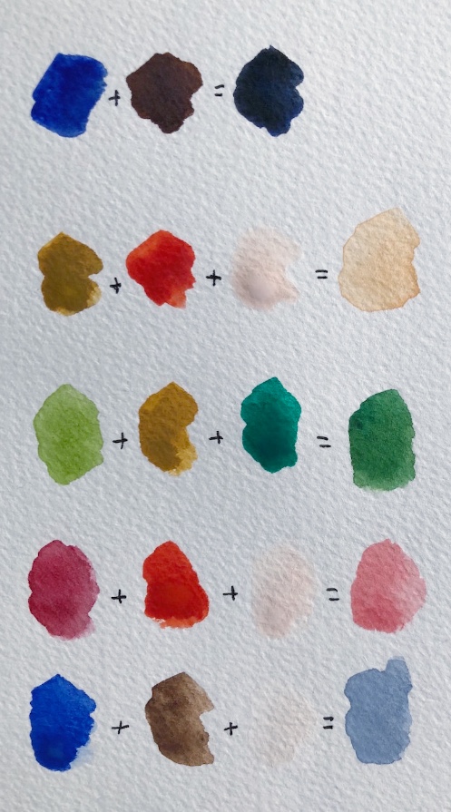
TOP ROW: The “sort-of black” here is achieved by blending dark blue and dark brown together. If I want a warmer black I add more brown, if I want it cooler I add more blue. Because it’s not “true black,” it looks more natural on the page.
SECOND ROW: I mix light-brown, orange and white together with a fair bit of water to create this kind of neutral sand, which forms the base for all kinds of other colours I need. It goes well with greens, and is also a good starting point for skin-tones, as it can go lighter, darker, or a touch pinker
THIRD ROW: I paint a lot of botanicals, but find the ready-made greens are often unnatural. Also, there are just so many shades of green in nature, just one or two won’t cut it. Depending on what I have to hand, I most often mix a lighter green with a darker green, and then play with adding either light brown, yellow, or the sand I created in the second row above, to get the right tone for the leaf I’m painting.
FOURTH ROW: I’m not a fan of “candy pink” but I love a duskier pink in everything from flowers to sunsets to balls of knitting and an old lady’s hat. I get this by blending the dark red in my paint set with a kind of fire-engine red/orange also in the set, and then adding white until I get the exact depth I want.
BOTTOM ROW: The dove blue/grey here is one of my favourite colours, and I get it by mixing royal blue (as opposed to the dark blue of the top row) with dark brown, and white. It is a much prettier and more natural sky than just watered-down blue, and by adding a tiny bit more brown I can turn it into a lovely, soft grey, that is nice for animal fur, for example, or to add shading and texture to the bark of trees.
(NOT PICTURED BUT HANDY): Purple is quite difficult to make. Most of us know to blend blue with red, but too much red and you quickly get brown instead. I try going lighter first: I’d probably blend the dusky-pink and dove-blue colours in the bottom two rows together, to create a soft kind of lilac, then I’d add more of any of the colours in those two rows bit by bit, in order to get the exact tone I wanted. For me, this is easier than starting from scratch with just red and blue.
4. How to shade a painting
One of the easiest ways to bring a painting to life is to add shading. This not only makes whatever you’re painting look more three dimensional, it also adds interest and texture to what you have created. Imagine a painting of a cactus in a terra-cotta pot. You could simply paint the pot a terra-cotta kind of orange, OR you could create shading to help it look round, rough-to-touch, and give it that lovely aged patina that real terra-cotta gets.
Here are some of my tips and hacks for shading a painting:
A consistent light-source
The most important thing is to imagine a consistent light-source. Imagine shining a spotlight on whatever it is you are painting, or imagine which way the sun is shining or where the window is. Keep that light-source consistent in your entire pattern. It will do all kinds of weird things to people’s brains if the shadows on one part of your picture are on the left, and in the other part they are on the right. Light doesn’t do that (unless you’re a surrealist painter).
It’s lighter where the light is (duh, Naomi)
If the light is coming from the right, everything on the right-hand side of your picture (from terra-cotta pots to trees to animals to a bottle of wine) will be lighter and brighter on the right, and darker on the left. If the light is shining straight in front of your thing (like your terra-cotta pot), then it will be lighter and brighter in the middle, and get darker on either side. If the light is coming from directly above, the leaves at the top of your plant will probably be lighter than those at the bottom.
Shadows are not only about light and dark
Shadows don’t have to be created by simply applying lighter and darker versions of the same colour. Here are some of the ways that I create shadows in order suggest a light-source and create interest:
a) By using more or less intensity of the same colour (by adding more water to make it less intense)
b) By putting a watery drop of dark-blue, black or dark-grey into the areas that I want to shadow, after applying the first ‘main’ colour
c) By blending up two versions of a colour, one that is darker and/or more intense for the areas that are to be in shadow (for example in the case of a terra-cotta pot, I will often blend up two versions of the neutral ‘sand’ colour I shared above, one that has slightly more light brown in it, and another with a bit more pink. The first will be my main ‘in the light’ colour, and the second will be the darker shadows)
d) By using a completely different colour for the shadows, which might be unexpected but, because it is darker or stronger than the lighter areas, still tells viewers’ brains: “this is shadow.”
e) By painting the object one colour, and then “blotting away” the part I imagine to be in the sun, by pressing a paper-towel down over that part. Pressing the paper towel down immediately will remove all the colour. Instead, I like to wait a short while (a minute or thereabouts) and then press - that will take away some of the intense colour, but leave a softer version.
What ever technique you use to create shadows, if you want to have a soft or even invisible transition between the light and shade sections, a good tip is to take a clean, wet paintbrush and gently brush water over those “transition lines.” I don’t always bother with this because sometimes I like things to look a bit more rough and deliberate, but you can create a very natural, organic transition from light to shade if you want to, just using water in this way.
Here are some examples of different ways I’ve created shadows:
In this partial painting of a castle in Dinan, I used a watery dark blue to create the shadows, despite there not actually being any “blue shadows” on the golden stone walls
In this painting of a whale I made for a Boots Paper greeting card, I used a rather unnatural aqua blue as the shading at the bottom of his belly. The brightness of the blue, and contrast to the much more washed out almost-white of his body, creates the shade I wanted, while also suggesting a watery “whale in ocean” feel that I wanted, despite not painting the ocean
In this greenhouse mail-art picture, I used three different blends on the terra cotta pots to show the light, middle and dark sections of the pots (and to add interest and texture), and blotted some of the way almost entirely, then added white paint, in the areas I wanted to appear super-light. (Here is another picture of pots in which I was - slightly - more subtle in the shading)

5. Paper, and paper towels
Paper weight
(As in, the weight of the paper, not the old-fashioned paperweight that your grandfather kept on his desk).
In general, it is best to paint with watercolours and gouache on paper that has been specially made for that purpose. Watercolour paint is thicker than ordinary paper, which helps to stop it from going bumpy and buckling with all that water. So to give you an idea:
Ordinary copy-paper is usually 80gsm (gsm just stands for “grams per square metre” and refers to the weight, or thickness, of the paper)
A fairly average watercolour paper thickness is 185gsm
Obviously, you can experiment to see what works for you. I have used copy paper plenty of times in my mail-art, and just flatten it down under books overnight if it buckles too much.
But if you pop into an art supplies store and ask to buy watercolour paper, it can be a little overwhelming. There’s weight, there’s texture, and there’s all those different methods of making the paper itself. How do you choose?
Here’s what I have experienced so far (although please remember - see the top of this longgggg blog post - that I am an amateur):
Rough, textured watercolour paper looks fantastic on those old watercolour landscape paintings you might have seen. It gives a lovely tactile feel to the painting
If you want to paint something for printing (such as something for a book or stationery, like my illustrations for Boots Paper), the texture might go against you, because it will stand out too much against the smoothness of the page elsewhere
Paper that is “hot pressed” gives you that smooth feel I’m talking about, and the other benefit is that the paint dries quite quickly on it so you can layer your colours on quickly
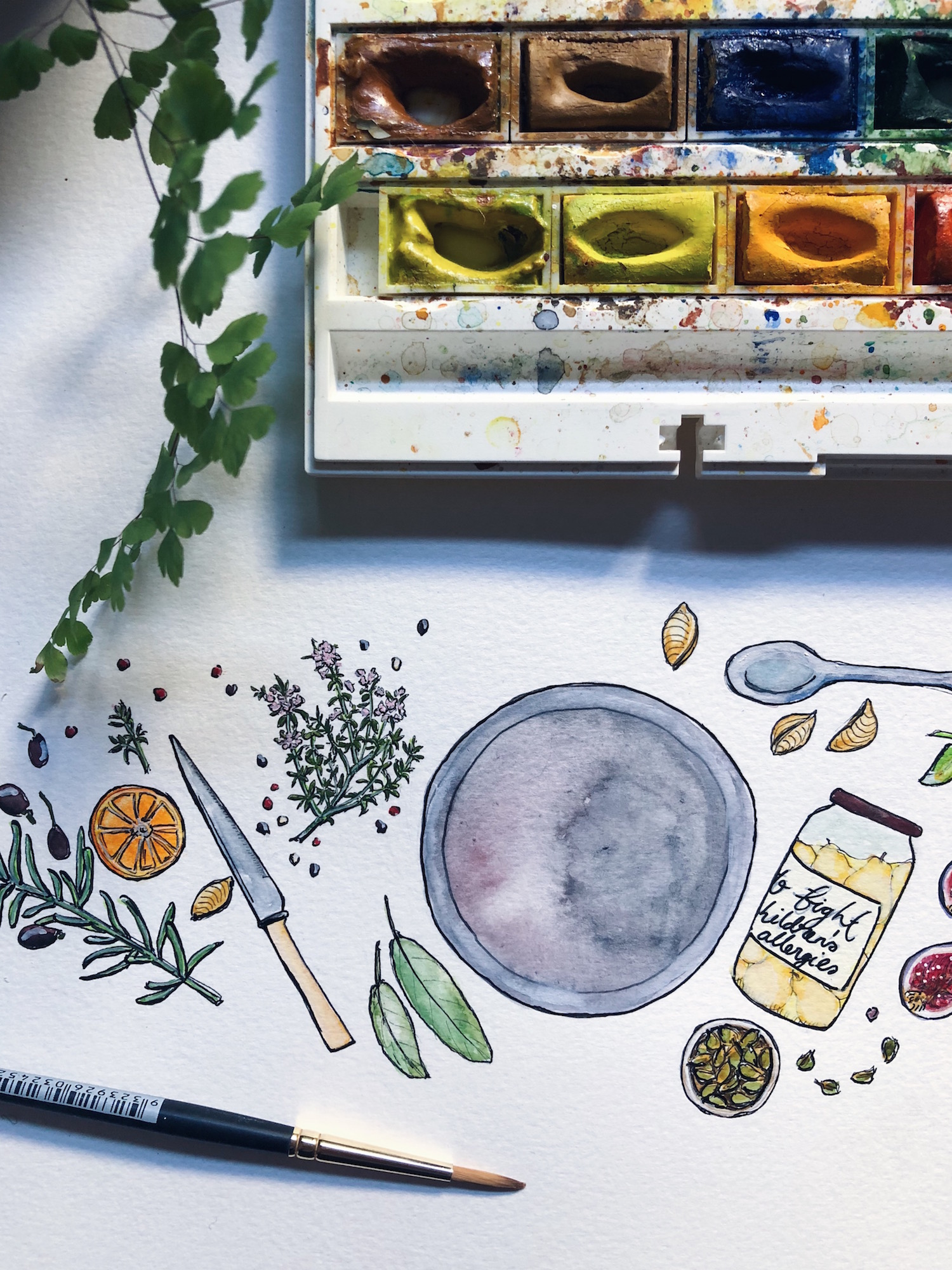
Paper that is “cold pressed” tends to be slightly more textured (though not necessarily as rough as the old-fashioned paper I mentioned earlier) so the paint stays wet longer if you want to create some effects using water and blends. (As an example of this, take a look at the image of food around a grey dinner plate I shared earlier: the dinner plate was left blank because a logo was going to be added inside it, but for subtle interest, I used a lot of water to create that slightly ‘bleeding’ effect you see, reminiscent of glazed pottery)
Most watercolour paper is either cream or white - think about what you mostly like to paint when you choose, and the tones you prefer. For my Boots Paper illustrations I use a slightly more creamy background, because that is what Boots’ owner, Brenner, prefers. For my own work I like a brighter white, because I prefer cooler tones
Preparing the paper
Confession: I never do this. I mean never. I have never even tried it. However… best practise is probably to stretch and then tape down watercolour paper, to ensure you have a perfectly flat surface, and that the paper doesn’t buckle with all the water you apply.
Perhaps if I painted more landscape-style images with big wash areas, I’d have felt the need to learn how to prepare my paper sooner, and have cultivated this good habit. Because my illustrations are mostly quite small, it hasn’t been an issue (so far).
If you want to learn how to prepare your paper (or want to teach me), here’s a tutorial.
Paper towels
My favourite painting tool, other than paints, brushes and water, is a trusty paper towel. My favourites are the kinds that have little patterns embossed on them. I always have one or two paper towels beside me when I paint, and I use them to:
Clean brushes (after I’ve cleaned them in water, I wipe them off on paper towels to be sure they don’t have any paint residue left on them)
Blot away mistakes (if the paint is still wet, you can blot it with a paper towel and you are magically back to blank paper! Even if the paint has partly dried, try wetting it thoroughly with a brush, then blotting)
Blot sections of an image to create a feeling of light and shade, as I mentioned above
Create texture. If there are embossed patterns on the paper towel, it can be fun to actually use this in my painting: I press the paper towel over the paint while it is not quite dry (but not super wet or the paint will disappear) to create a fun, mottled pattern
Here is a short video in which I use a paper towel to create light and shade in my picture, let the paint partially dry (while I sip tea, naturally), then create a new layer in a different colour.

I hope this blog post was useful! I feel a little bit silly and vulnerable writing about “how to” on something I really do just muddle through, and feel about as far from being an expert as you can possibly imagine.
This lack of training probably makes me a fairly poor instructor: if there was something you were wanting to know from me about how I do my painting, but I’ve failed to mention it here, feel free to ask away. Likewise, if this actually is useful to you and you’d like to know more (such as some tips on drawing, for example, which in all honesty would be equally bumbled-through), let me know and I’ll see what I can come up with.
But no matter what, I DO hope this long post inspires you to pick up that dusty old paint-set (yes, the one you picked up for your kids at the supermarket) and wile away an afternoon playing with colour.

Frequently asked

I thought it was about time I answered the questions I receive the most, somewhere that they could all be found in one place. Have I missed something you’d like to know? Feel free to ask away in the comments, and I promise to reply.
Here we go…
How do you get watercolours to show up brightly on brown kraft paper?
The secret is they’re not just watercolours. I also use gouache paints, which look and feel pretty much the same, but are chalkier in consistency, and brighter and more opaque on the paper. Back in the old days, poster artists often worked in gouache. I mix my gouache and watercolour paints together within my images (and often combine them with one another to create the exact colour and consistency I want).
What pens do you use in your artwork?
I use fine-line archival ink pens for outlines and details in my paintings, and to write the addresses in my mail-art. The ink is waterproof, so it doesn’t run with the paints. My favourites are these Sakura Pigma Micron pens, and I have a collection of nib sizes that range from 005 (very fine for detailed work) to 05 (thick and bold, good for addresses).
Where can I find likeminded pen-pals?
There are loads of places to find people to write to. Pen-pal groups, yes, but also other projects and programs through which you can brighten someone’s day with a handwritten letter. I shared a list of some of my ideas for the show notes of this podcast episode with Tea & Tattle (scroll to the bottom of the show notes to find the list). I also teach about finding like-minded people to write to (and people who will write back) in my letter-writing e-course.
What camera do you use on your blog and Instagram?
To be honest, 99 percent of my photographs these days are taken using my iPhone. I have a DSLR Olympus PEN camera that I love, and it definitely takes better pictures, but the reality is that I can’t always carry it with me everywhere I go. The iPhone lets me capture small surprises and spontaneous moments in my day, no matter where I am.
Whats happening with the Meals in the Mail project?
Ahhh, that project. Meals in the Mail remains one of the favourite projects I’ve ever run. Here’s where it’s at: at the start, I promised to turn all the recipes into a book, but I received more than 250 letters (after expecting 20-50). To share the recipes, mail-art and stories in this way would make for a book that was around 750 pages long, which would be as unwieldy and impractical as it would be impossibly expensive, so I had to rethink.
I dabbled with the idea of giving the project its own blog instead, but that felt flat to me, and didn’t do these wonderful letters justice. So right now I am in the midst of making the recipes myself, one at a time, and talking to the makers about their food and the stories that make them special, for a podcast project. I can’t wait to share when it’s ready.
When will your snail-mail book come out?
Soon! The copy is finished and edited, the cover is done, and the design is in place. I am finalising some extra illustrations needed, and then it’s off to print. More about this book here.
How do you find the time for all your creative projects?
I could be glib and say there’s never enough time, and that’s certainly true to an extent. I’m definitely not as productive as I’d like to be (case in point the snail-mail book above, which has been in progress for more than four years!). But I do have some tips for finding or making time to be creative, or maximising the little bit of time we have. I’ve put them all into a little e-book called “Time to Make,” which you can download for free when you subscribe to my newsletter (which you can do here).
How can I do more with my creative ideas / start selling my creative work?
I teach all of my knowledge on the personal aspects of creativity (creative block, perfectionism, confidence, time, those sorts of things) in my hybrid coaching and e-course, Create With Confidence which runs once a year. For people who want help going public to share or sell their creative work I have a self-paced course called the Sales & Social Masterclass for Makers, which you can join at any time. I also share tips for free in my newsletter, and am happy to answer your questions via email.
Why and how did you come to spend so much time in France?
Think of that self-imposed sabbatical as me cashing in my ‘holiday savings’ after seven years of not stopping. The idea was my husband’s, after he knew he’d be heading to Italy for work in 2018, and thought that if the children and I were nearby we could all meet up.
We chose to stay in Brittany in France because that’s my family background on my father’s side, and we wanted the children to learn a little of the language and culture that was part of their heritage. At ages four and six, with Scout only in her first year of school, it was an ideal time to travel, before missing so much school became a problem.
I am lucky that I work from home, so I didn’t need to take leave from any bosses. I worked ridiculous hours in the lead-up to the trip, which in retrospect wasn’t the healthiest of ways to save money (ever heard of just “not spending,” Naomi?) but even so, we will be probably be paying off the debts incurred during this time for quite a while.
It was worth it.
That’s it from me for now. As I said, please feel free to ask me anything I haven’t covered yet here. Or (better still), tell me about you! What do you love, make, do, feel?
Snail-mail: outgoing lately
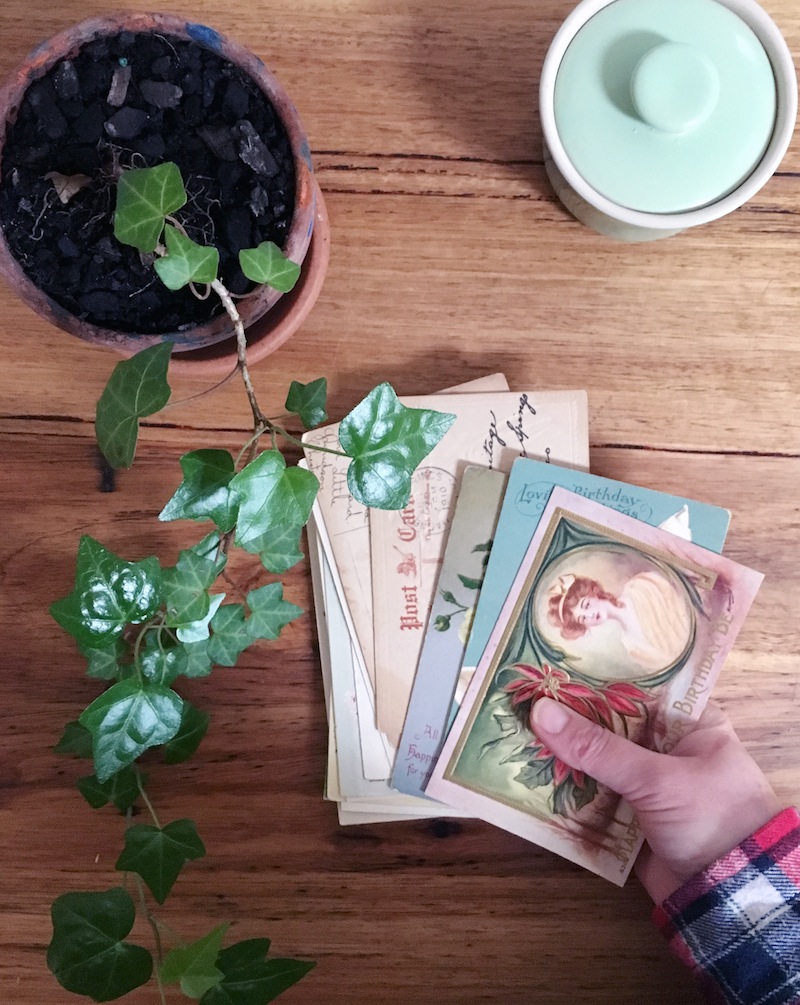 I've been quiet on here but loud on life lately. Thanks for sticking around! The photo at the top of this page is of a stack of antique (100 years old or more) birthday-themed postcards I sent out to folks on Instagram, to help celebrate my own birthday last week. Here's some of the other mail I've posted during the past couple of weeks...
 ∧∧ This great big stack of letters and aerogrammes
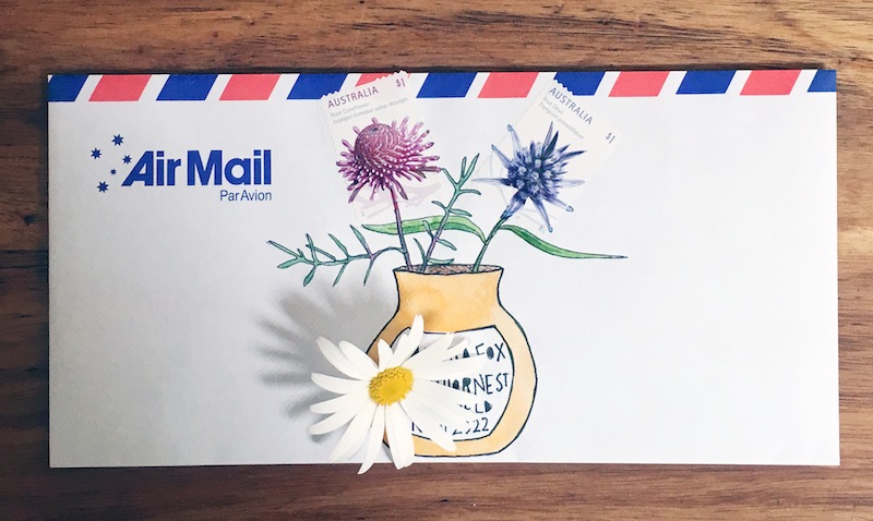 ∧∧ Putting Australia Post's flower stamps into a vase
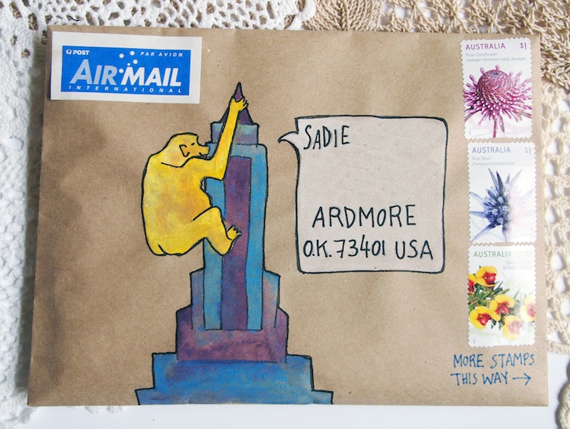 ∧∧ I was painting King Kong mail and my daughter begged me, "Make him gold?" So.
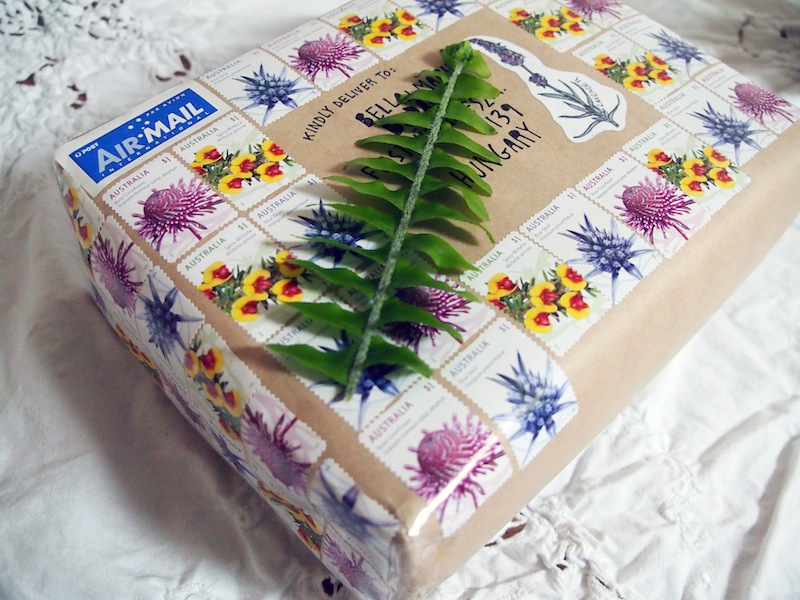 ∧∧ Dear Australia Post: I am probably your biggest fan and definitely one of your biggest customers, but sending parcels overseas is getting ridiculously expensive. Thankfully, pretty stamps for the win. (Personal budget for the loss)
 ∧∧ Herbal mail-art for an aromatherapist
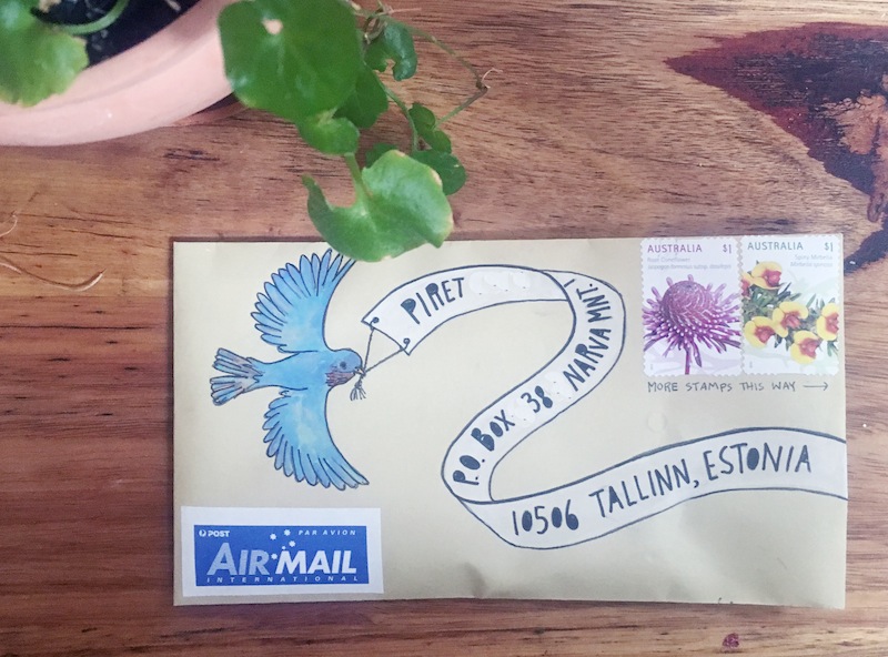 ∧∧ A little bluebird carrying a message to Estonia
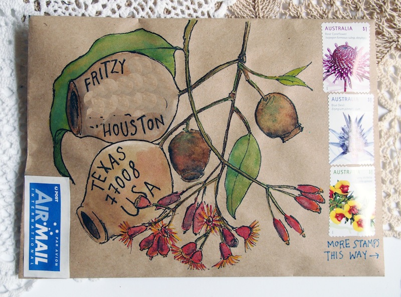 ∧∧ All those herbs and flowers I've been painting... I thought it was about time to try my hand at some Australian natives
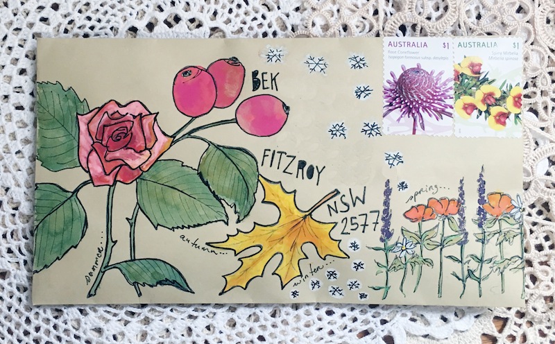 ∧∧ This was my attempt at a four-seasons envelope: summer, autumn, winter, spring. Winter was tricky: the white gouache paint I used for the snow-flakes kind of melted into the envelope and turned out more blobby than bright. Onwards and upwards
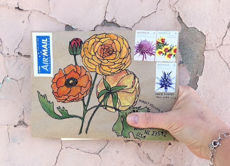 ∧∧ I planted ranunculus corms in my garden in May, and to my delight (and surprise, if I'm honest), they actually grew, and are blooming in abundance
That's all, folks!
Mail art - prickly post
 Yawwwwwn. I was up until 1am last night making mail-art gifts for some friends. Those parcels (three of them) are not pictured here, because there wasn't any natural light in which to photograph them once I'd finished, and Mr B took them off to post when he left for work at five o'clock this morning. We are a sleepless family!
After two weeks of viruses rolling through our family, taking us down one at a time and working through each of us and then having the audacity to try and start all over again... after two weeks of being more up at night than down, and washing more sheets and towels and little pyjamas than I ever thought it was possible to wash, this weekend finally offered the hope of a reprieve. Nobody was ill, everybody kept down their meals, and we managed to wash and dry and fold and put away the mountain of laundry that had become so big that at one point we entirely lost sight of our couch.
Free from family sickness (but in my weakened, possibly hallucinatory state haha), I began noticing things around me again, especially in my little garden.
All too often, I have failed to give spring the love it deserves, the love almost the entire rest of the world gives it. It's not spring's fault that it is the harbinger of the harsh Australian summer, that's just the order of things, after all. But this year, for the first time since high school, I have a garden again. And that makes all the difference.
In the minutia of my tiny garden, I watch the seasons come in and out with new eyes and new appreciation. The ancient turning of planets and sun and growth and death, all played out in miniature in my little garden: a living diorama, kept alive by the clockwork mechanics of Nature and Time churning silently but relentlessly outside the four tall walls of my green little oasis.
And I, peering in, stepping in, and watching.
* The sage bush has grown at least 10 centimetres since last weekend, in the heady potion of warmer weather earlier in the week followed by soaking rains later on
* There was a honeyeater in the Chinese Lantern tree. We never see honeyeaters in the city! Also, on a warm but windy Wednesday, two little doves happily sunbathed on the grass out the front of the children's cubby house
* The coriander that I thought had died last year is once again alive and flourishing and ready to season big bowls of summer guacamole
* All the dormant trees are budding into life. The pomegranate tree is beyond budding - it has exploded into spring green
* Bluebells! Bluebells everywhere!
* One of my original camellia bushes has gone to god
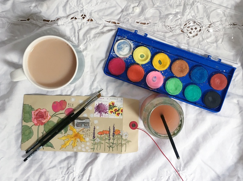
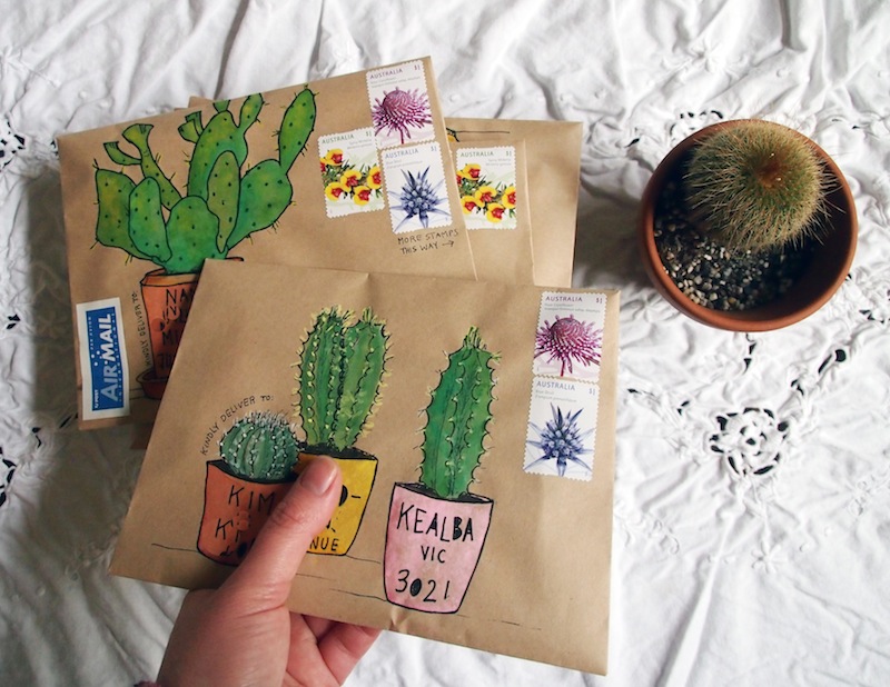
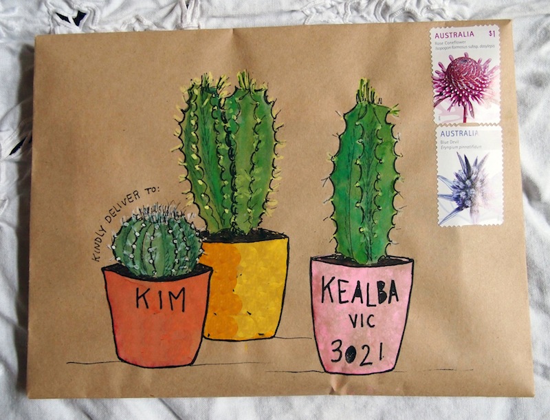
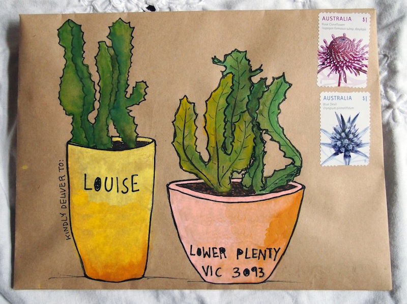
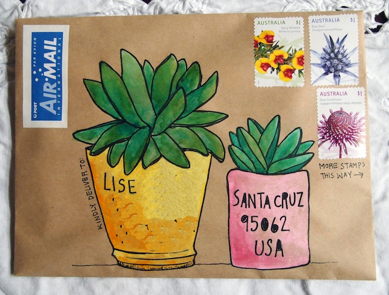
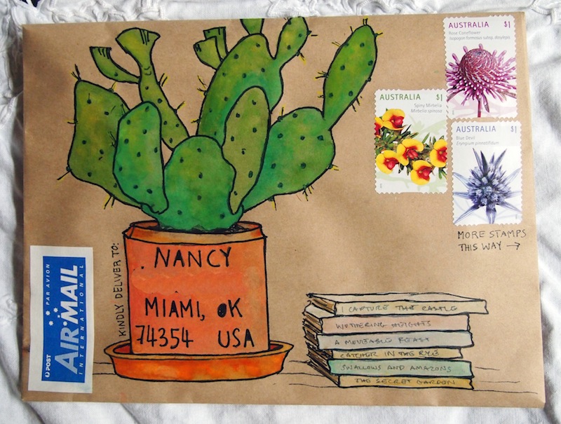
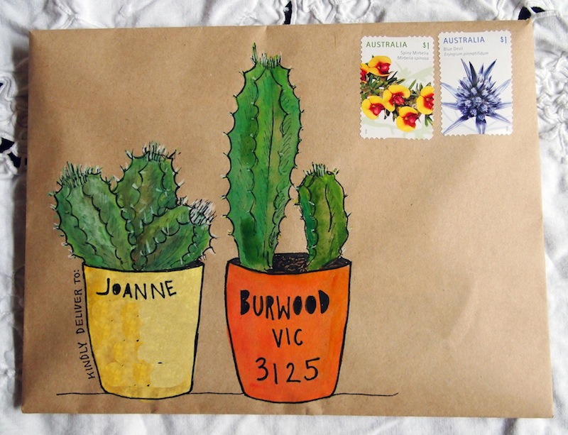
The warm spring-rain was way too persistent for my tiny little cactus-in-a-pot, so I brought it inside, and that's what inspired this round of prickly mail-art. Once I got onto a cactus-and-succulent roll, it was hard to stop. These little guys are just so fun to draw!


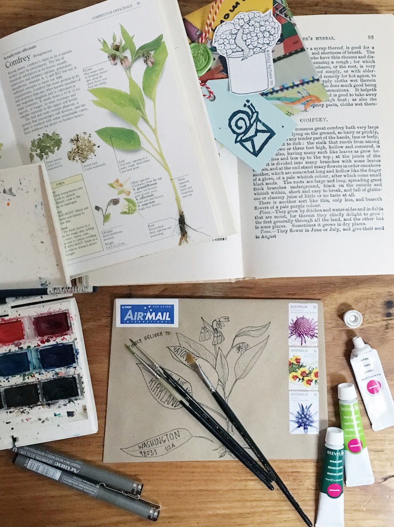
A recipe for mail-art
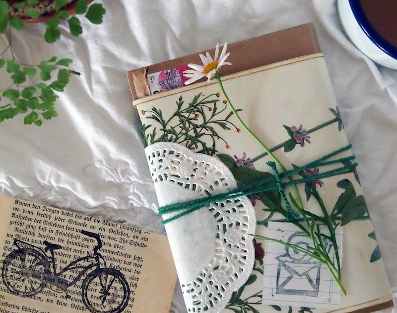


I have been so busy making mail lately! Cutting out little packets of handmade stickers and labels, collecting vintage stamps, hunting for postcards old and new, photocopying old recipes and household tips that once belonged to my great-grandmother, then bundling them all up together in handmade envelopes from old catalogue pages, melting green or red wax over the fold, and sealing them shut with a big, bold N.
Lately I've noticed that a lot of you guys have been using the comments section of this blog to ask for tips and tutorials on how to create mail-art. So I'll do my best to oblige you in this post but, to be honest, the beauty of mail-art is that there are no rules and no standards. No tests to pass, no clubs to join, nobody to judge the "artistry" or talent of your work. Or mine. If you put some creative effort into it, and if you call it mail-art, it is mail-art.
That being said, here's the process of how I personally choose to whip up a batch of mail-art (and if you're new to this blog, samples of the finished products are here).
Ingredients:
* Brown kraft paper * Scissors * Glue-stick * Pencil (I use 2b) * Eraser * Pencil-sharpener * Black felt-tip pen (waterproof) * Watercolour paints * Gouache paints * A variety of watercolour paint-brushes * Postage stamps * "Via Airmail" stickers (if applicable) * Sticky-tape * Washi-tape (optional) * Sealing wax and seal (optional)
Method:
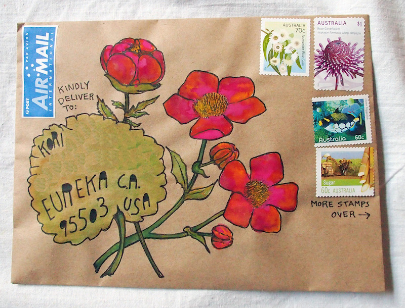
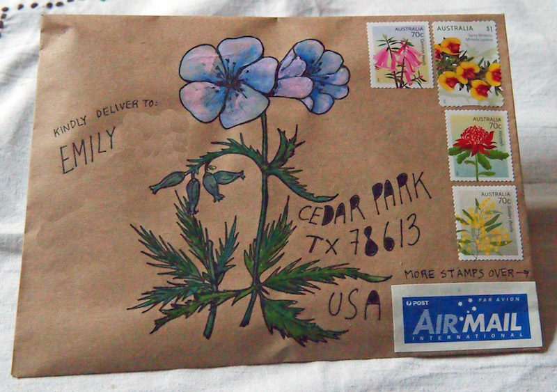
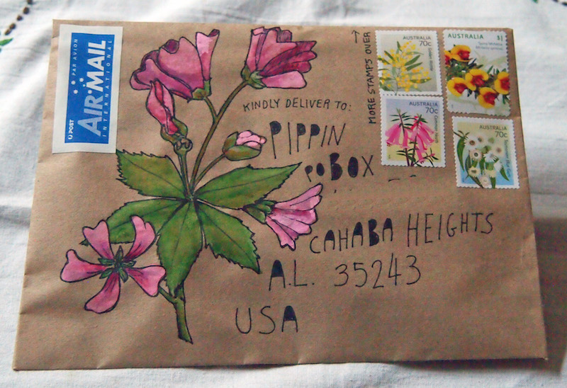
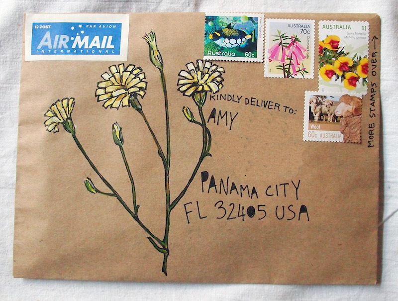
Step 1: Most of the time I hand-make my envelopes out of brown kraft paper. To do this, I open up an existing envelope and use it as a template, to trace onto the kraft paper. Cut it out, and glue the sides together. Use a glue-stick or paste rather than liquid glue, so you don't end up with lumps and bumps in your envelope.
TIP: I like to make the envelopes so that the rough side is facing outwards, rather than the shiny side, because it takes paint better later on when you come to that
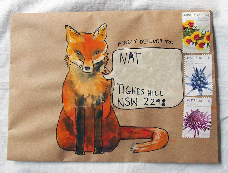
Step 2: I roughly draw my design onto the front of the envelope, in pencil. This means sketching a drawing - a plant, an animal, a cup of tea, and working the address into the design. Sometimes I write the recipient's name and address next to the drawing, but if possible, I try to fit it into the actual drawing, such as onto the petals or leaves of a flower, a mug of coffee, a speech bubble, the pots of a series of house-plants.
TIP: In your design, leave enough room on the top right of the envelope to fit one or more stamps later on
Step 3: Now I go over my drawing with a firmer hand, using a black, felt-tipped pen. I use the Sakura Micron brand, and have a pack of pens that range from point 0.1 to 0.8 in thickness, depending on what kind of line I hope to create.
TIP: Always use water-resistant ink. This way when you paint them the ink won't run, nor will the essential details (addresses, for example!) run if the letter gets wet in the rain
Step 4: Next, I paint my design using a mixture of watercolours (Winsor & Newton) and gouache (Reeves). Gouache creates a thicker, chalkier, brighter colour than watercolour, especially on the brown paper, so I use these paints where I need the colour to stand out. I use watercolours when I want more subtlety. To help the postie read the address in my mail-art, I aim to make the parts of the picture containing addresses brighter and lighter in colour than the others.
TIP: When sending mail overseas, it's important that the destination country is big and clear and, if possible, in the same area or colour as the rest of the address, so it won't be missed
Step 5: Once the paint is dry, I pull my felt-tip pens back out, and go over the outlines again to give the drawing definition. This is particularly important to ensure the address is clear and stands out, even more-so if I've used gouache, because if applied thickly it can be quite opaque, and the writing needs to be reinforced over the top.
TIP: If I feel the postie may need more direction to send this mail where it is supposed to go, I draw little arrows pointing to the start of the address, and write the words "Kindly deliver to" above the recipient's name
Step 6: Now I put the stamps on the front-right. Rather than use those ugly Australia Post printed labels, I prefer to use lots of stamps to make up the postage. If they won't fit on the front without ruining my design, I continue them over onto the back of the envelope.
TIP: If you need to do this, too, make sure that there is at least one stamp where it is supposed to be, and write the words "More stamps over" to ensure your postie knows to look there
Step 7: If I'm sending my letters overseas, I affix a "Via Airmail" sticker to the envelope. It's supposed to go on the top left-hand side, but fitting it anywhere is usually enough to alert the postie to the fact that this is international mail.
TIP: If your mail is travelling domestically, don't stick a "Via Airmail" sticker on it. I've made that mistake before, and the postie has confused my letter for international mail and not known where to deliver it
Step 8: Almost done! Next, I clearly print my return address on the back of the envelope. I had a stamp custom made to do this and I don't know why, but it gives me a lot of primitive pleasure to ink it and stamp it onto each letter.
TIP: If you've needed to add extra stamps to the back of your envelope as per Step 6, make sure you write the words "Please return to" or "From" above your return-address, so the postie doesn't mistake it for the destination address, surrounded as it is by all those stamps
Step 9: Finally, I fill the envelope with all the contents I have created and collected, then close up the envelope with sticky-tape. This doesn't look very good so, if possible, I then cover the tape with something pretty, like wash-tape, a handmade sticker label, or another wax seal.
TIP: Make sure there are no loose parts of your envelope that could catch on things and tear during its long journey through the post. Tape everything down
And that's it, my process for making mail-art from start to finish.
How about you? How do you like to decorate your letters? What ever you do, please know this one thing: if you get creative with your mail, you are a mail-artist.
ps. If you're in the mood for even more letter-writing inspiration, I want to remind you about my letter-writing and mail-art e-course, "The Most Beautiful Letter You Have Ever Written."

Over four weeks, I will guide you through multiple methods of making beautiful mail-art and creative, handmade stationery; teach you the art of writing and storytelling; help you forge personal connections in your letters and find pen-pals if you want them; and share time-management tips so even the busiest people can enjoy sending and receiving letters. There's also a host of downloadable resources, and access to my own private mail-art pen-pal group. Registrations are open right now, and you can find out more here.
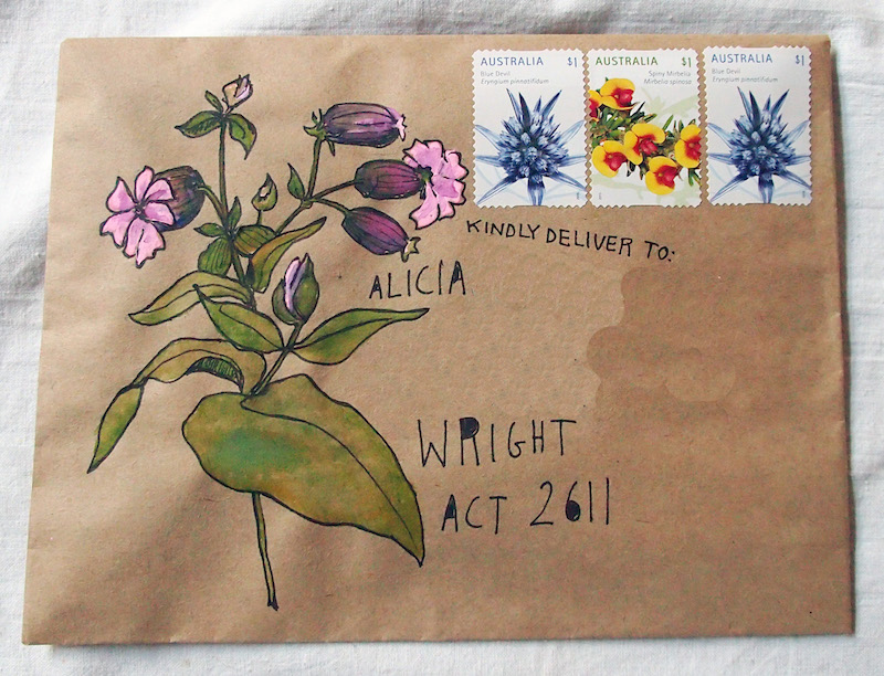
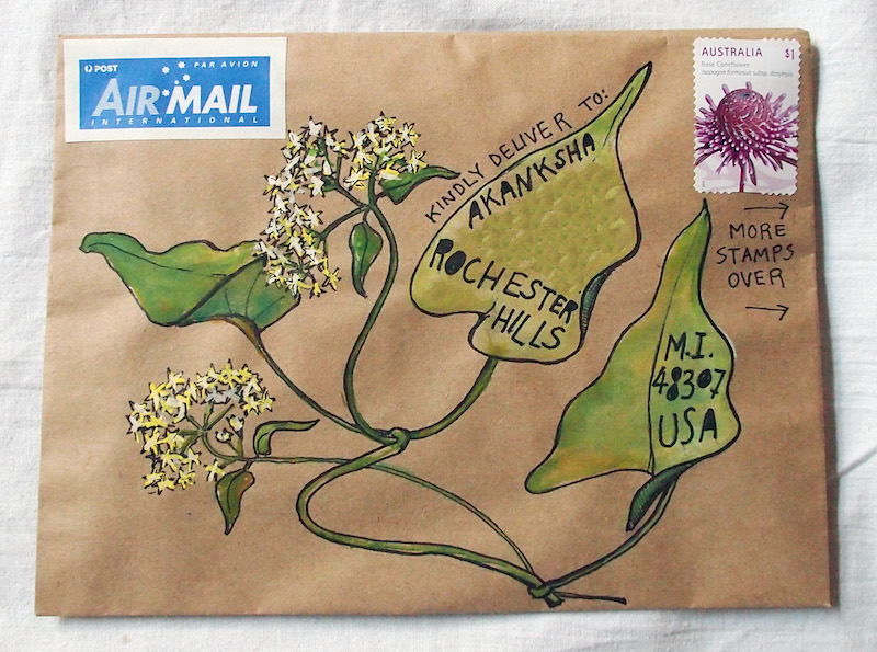
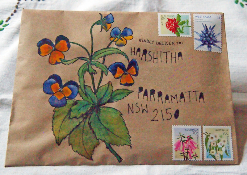
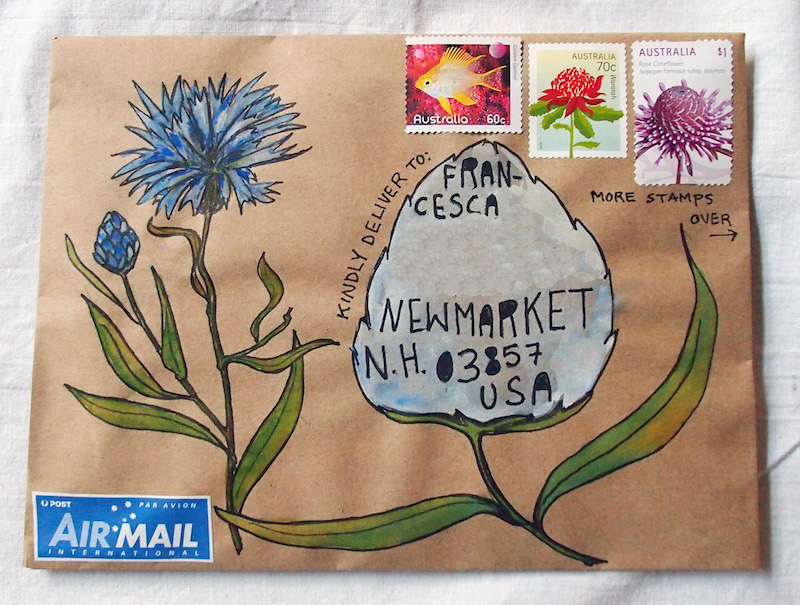
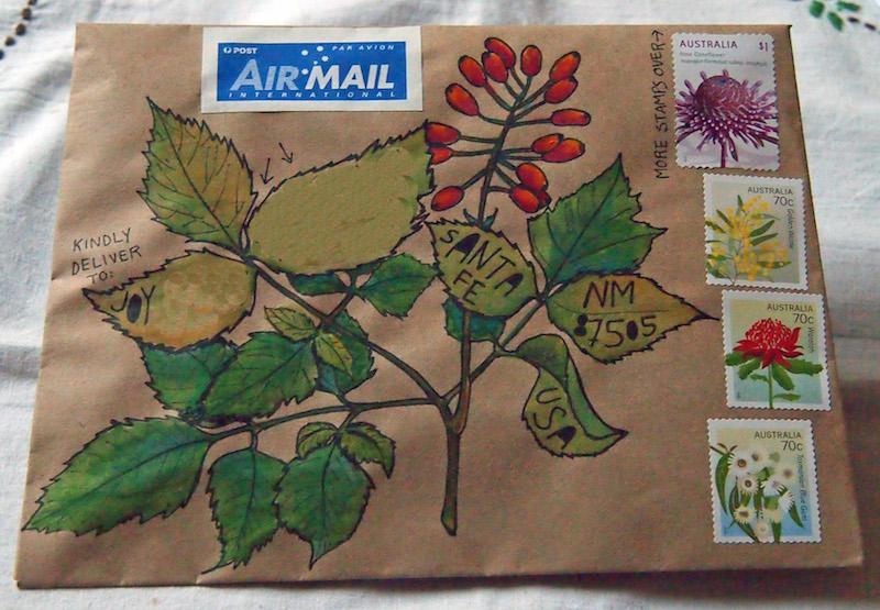
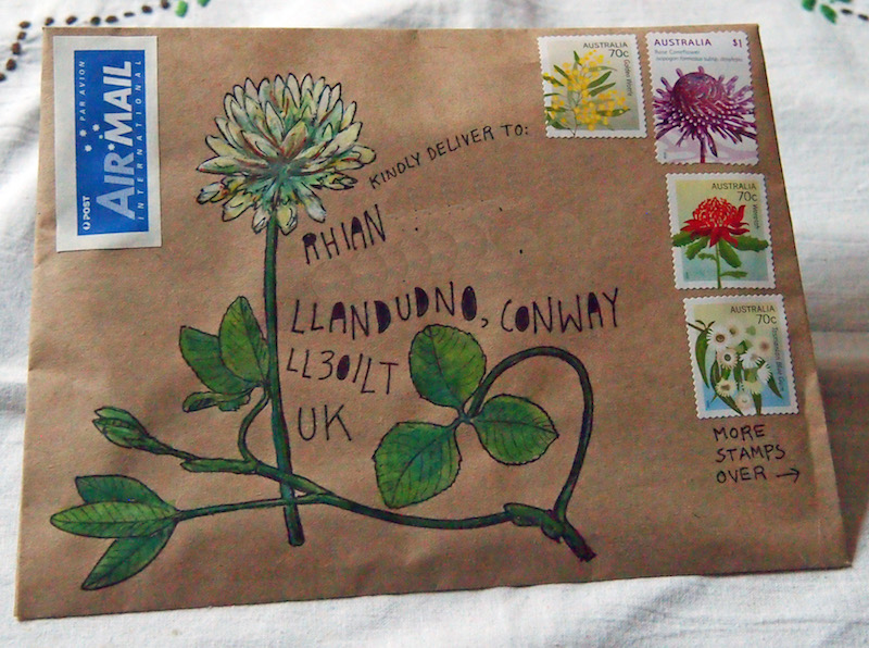
Mail art: while on holidays
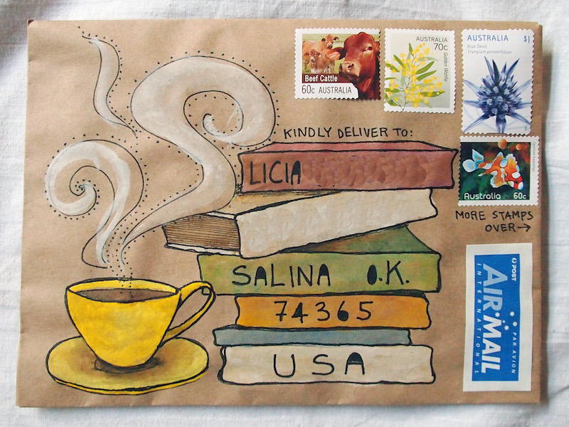
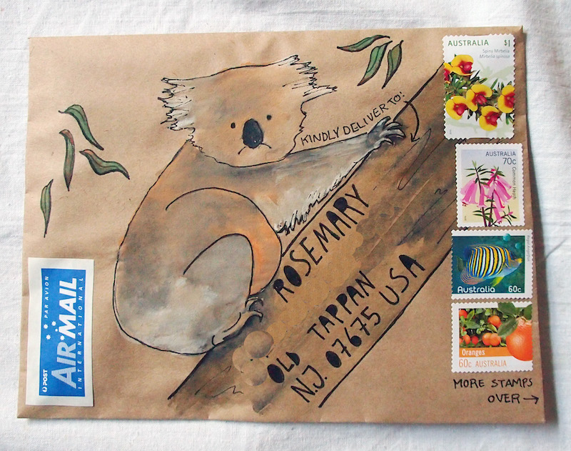
While we were in Sydney on our holidays, I painted these handmade envelopes to send out into the world. A pair of animals, books and coffee, but mostly wildflowers. I have a lot of fun painting wildflowers.
Also while we were on holidays, Scout made mail of her own. She asked to send a postcard to her best friend, chose the postcard, wrote her friend's name, signed her own name, and dictated a message for me to write. Mostly, it was a love message. "We rode a train," she said. "We went to the zoo." But mostly Scout wanted me to write "I love you" and "I love you more." She put the stamp on herself, and posted it herself.
I feel absurdly proud that this little mail project of mine has inspired my daughter to remember others in such a tangible and loving way. Scout and her friend are only four, but already they understand the joy that comes from sending and receiving letters. Long live snail-mail.
Onwards to the wildflowers.
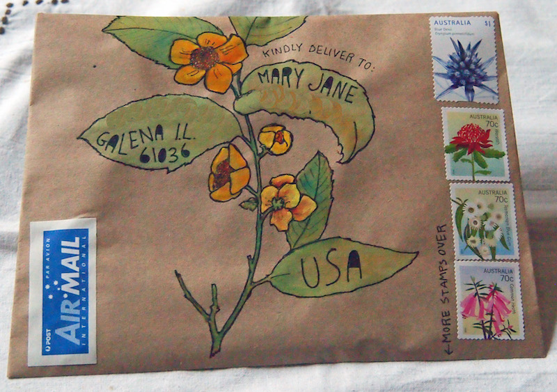
Mail-art: late harvest
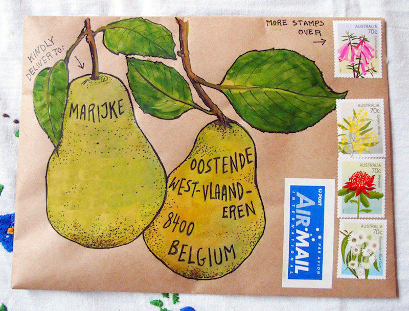
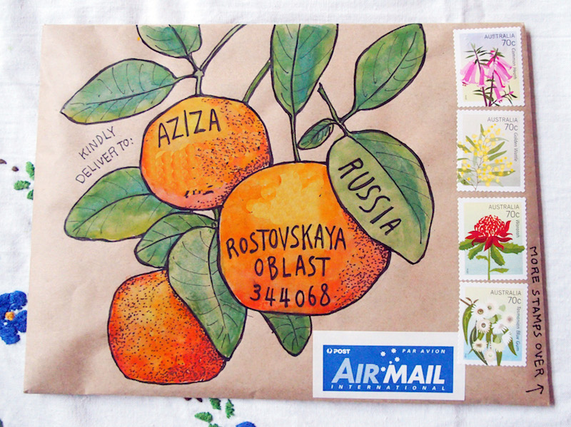
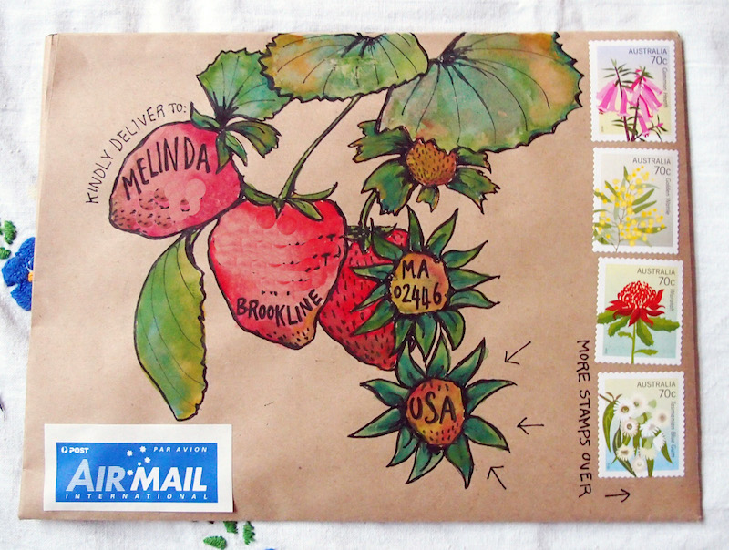
Do you know that feeling when you think something is getting on top of you, but you don't have the courage to look too closely into it, because it might be even worse than you thought? Yep, that feeling. And then you do look...
Well, I took a deep breath and then took a close look on the weekend, and discovered that I owe more than 65 mail-art letters right now. Ugh. I'm so sorry everyone! I hand-make each piece of mail, including what goes into it, and each letter can take me many, many hours. But I hadn't realised I'd fallen so far behind.
For this reason, I have decided to temporarily disable the form that lets people request this kind of mail, until I've caught up on the letters I already owe.
If you subscribe to this blog and have requested handmade, painted mail from me, I promise you are not forgotten. I appreciate you being so patient with me! And if you're reading this blog and would LIKE mail but haven't requested it yet, I promise to put the form back up just as soon as I've caught up, and I'll let you know in a future blog post.
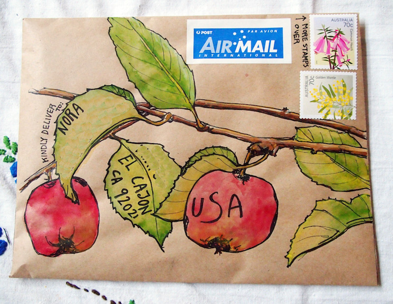
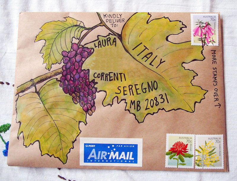
In the meantime, I thought it was time to share the fruits of my labour (see what I did there?) last week, being these five letters. The friends who requested them did so all the way back in March, which shows you just how behind I am in sending out my mail. I hope they still live in those places (!) and that they like their harvest-themed happy-mail, despite the delay.
Mini mail-art
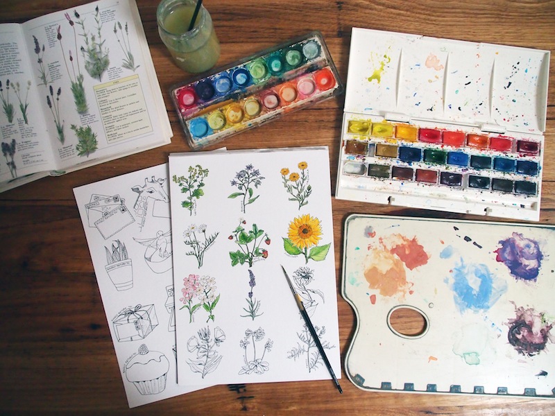
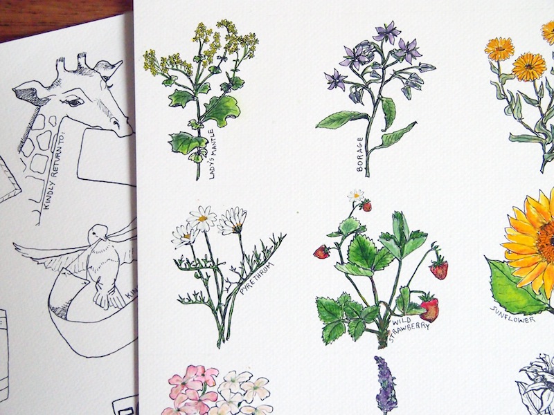
Hello, dear friends. This is just a little something I've been working on, to give to the subscribers I write to via this blog: mini mail-art. I've made a series of 12 water-colour botanical stickers that people can use to decorate their next mail; and another 12 "return address" stickers for them to personalise with their own addresses, and then colour if they want to.